Echo Art Museum Mobile App
Overview:
Echo is an art gallery that focus’ on modern artwork from new up-and-coming artists, and hosting events that gather the art community together in a shared space.
Challenge:
Art museums often have outdated or limited digital experiences. Visitors, especially younger audiences, feel disconnected due to a lack of interactive features, guidance, and accessibility tools within the museum space.
Goal:
Design an intuitive mobile app that simplifies ticket purchasing, event discovery, and exhibit access — while building a cohesive brand identity that resonates with a wide, diverse audience.
Role:
Role: UX/UI Designer, UX Researcher, Brand Designer, Concept artist
Platform: iOS Mobile App
Timeline: 4 months
Tools: Figma, Adobe XD, Adobe Illustrator, Canva
Results:
An accomplished cohesive brand design and concept. A clean app design with accessible ticket purchasing at the forefront. A focus on exhibit information with detailed information for users to gather more information. A contact page in order to communicate with support easily.
Initial Research
Methods
Competitive Audit
Surveys
User interviews
Usability testing
Participants
6-8 Potential Users Surveyed
Ages 19-62
User Goals
“It’d be nice to find out about new exhibits and events quickly”
”I want to be able to purchase my tickets in advance”
”I want to be able to contact the museum if i have more questions”
Since this project was created for a fictional museum, I began by developing the brand identity from the ground up. In order to inform my design decisions, I conducted research on both local and national art museum apps and websites, analyzing what made their UX/UI effective of ineffective. Through this process, I collected information on products that were offered, unique value propositions, brand identity, and tone of the content on competitors pages. I focused on the benefits and drawbacks of each mobile websites experience, features, accessibility, and user flow. I also interviewed several potential users about what they look for when they are searching through art galleries websites.
Pain Points
Overwhelming info
Poor Navigation
User Flow disruption
Mobile Optimization Issues
Key Insights
People often want more information about current events and exhibits before booking tickets
Visitors want easy navigation
people enjoy curated “tours” for a quicker, themed experience
accessibility features (text size, contrast, audio) are often overlooked
I analyzed the strengths, weaknesses, and overall user experience patterns across each website. From these insights, I identified opportunities to enhance visual cohesion and build a stronger sense of storytelling through the logo and brand identity. This research became the foundation for developing both the concept and identity of my museum app. My goal was to ensure every design decision was intentional, purposeful, and rooted in a user-centered vision.
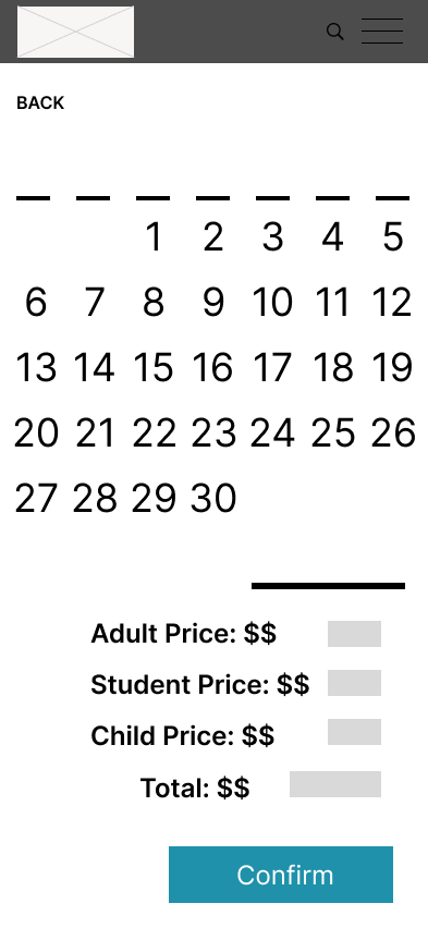
Brand Early Concepts VS Final designs

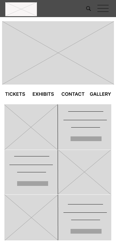


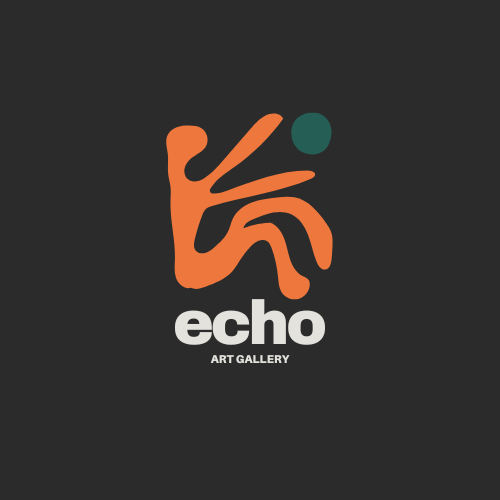
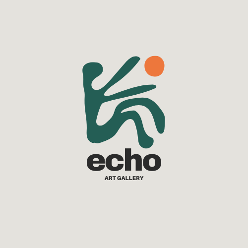
Design Iterations
As I moved into the design iteration phase, I focused on refining the UX layout to create a cleaner, more intuitive user flow — addressing one of the most common pain points I observed in my competitive audit. My goal was to eliminate unnecessary disruptions, such as external links that pulled users out of the app experience, and ensure that navigation felt seamless from start to finish. I designed each screen to balance clarity and depth, providing detailed yet digestible information about artists and exhibits without overwhelming the user. Throughout these iterations, I prioritized a streamlined path to ticket purchasing, making it easy for users to explore, engage, and complete their goals within a single, cohesive experience.
Focus Features


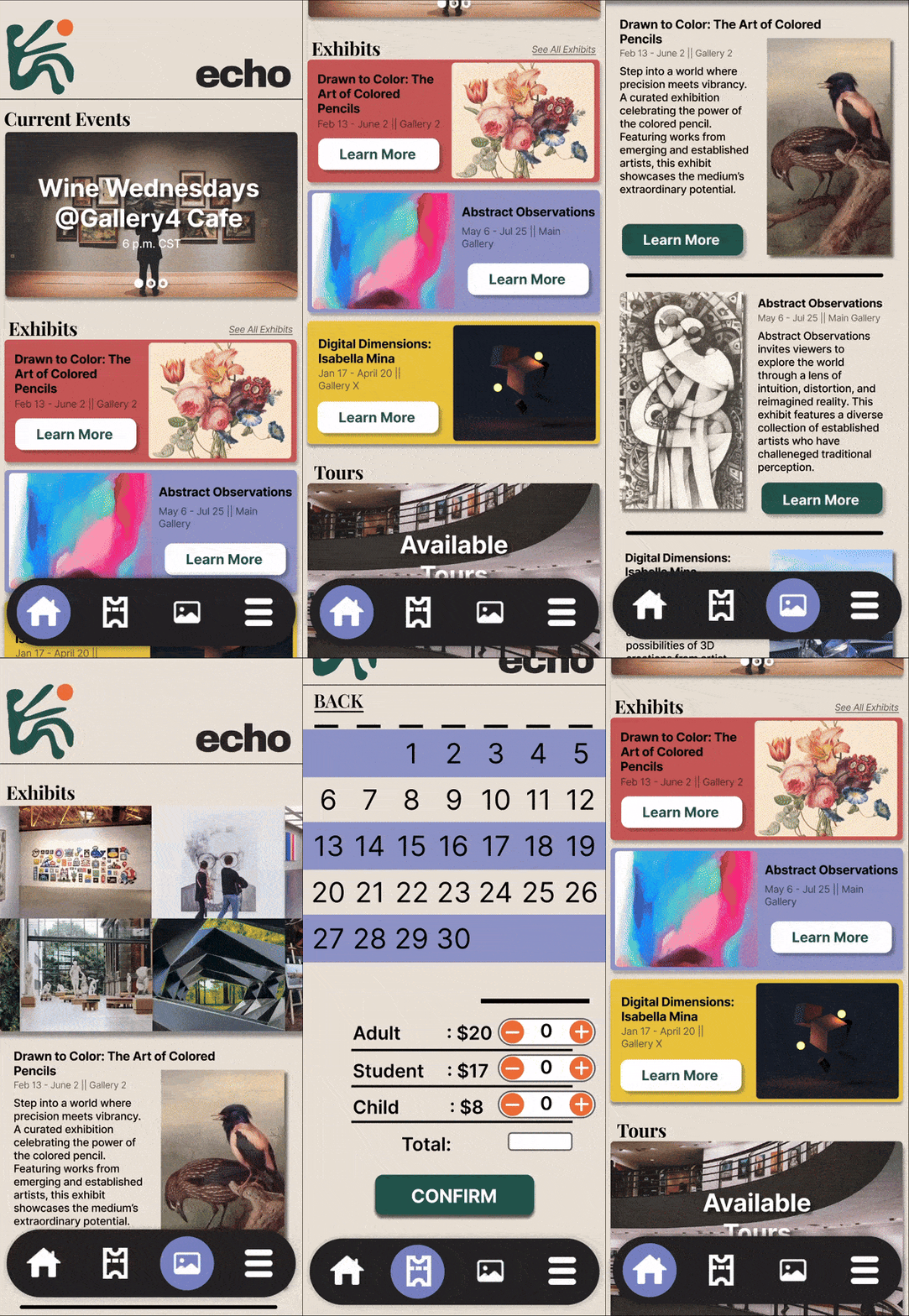
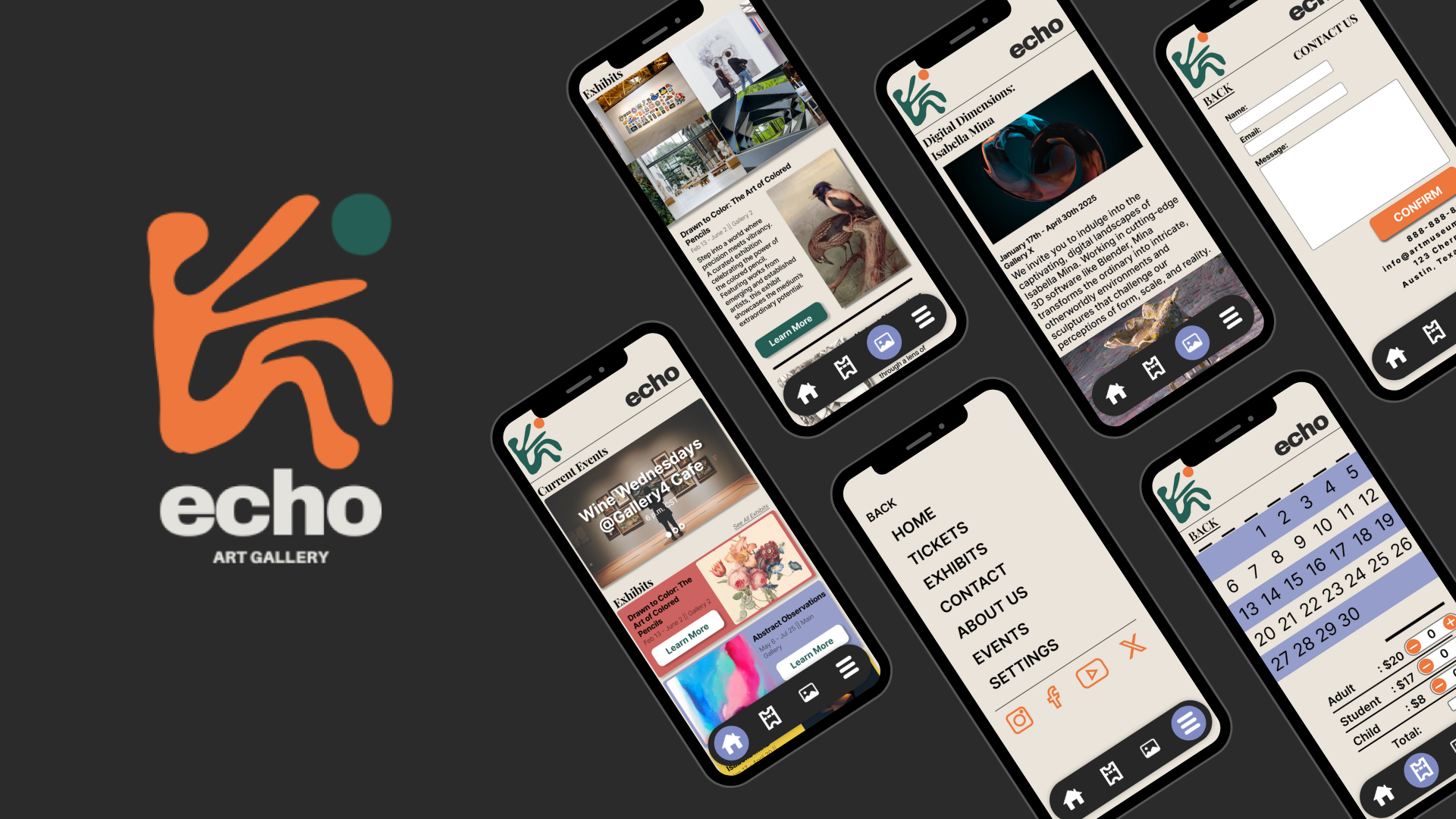
To strengthen the overall user flow, I focused on refining navigation through the app. I created an animated hovering nav bar as a central element of the app’s usability. Once in the early stages with Home, Tickets, Search, and Menu as the links and again as the finalized version with Home, Tickets, Exhibits, and Menu as the links. The final design features a bubble that moves as you click on which page you’d like to visit and the Menu icon takes you to a larger navigation menu with supplemental links such as Settings and links to social media.

I also wanted to implement a detail page for each current exhibit that goes into more detailed information on either the artist’s background, emotional theme, or cultural context of the show. Users can either access these pages through the home screen by clicking Learn More buttons on their perspective exhibits or through the exhibits page.
Conclusion
The final design successfully captured the museum’s creative and modern identity while providing an intuitive and accessible core user experience. Through usability testing, I confirmed that users could easily navigate the main features—such as the home page, ticket booking, and exhibits section—and understood the app’s overall flow. While I focused on completing the foundational structure of the app, there is still room for future expansion. Additional pages such as an “About Us” section, “Settings,” and dedicated “Events” page could further enhance the experience and provide a more comprehensive platform for users. This project strengthened my ability to build a cohesive design system from scratch and reinforced the importance of validating design decisions through user feedback. It also reminded me that great UX is iterative—there’s always potential to evolve and refine based on user needs.
